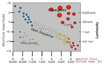
If humans have a life cycle, so do the stars. Not all stars were formed at the same time. Some are just beginning to shine and some are starting to die. Ejnar Hertzsprung and Henry Norris Russell created a diagram helps in understanding the lives of the stars.
The Hertzsprung-Russell diagram does not actually give the location of the star but rather their absolute magnitude or luminosity and their temperatures. In this diagram, each star is represented with a dot. And because there are lots of stars in the universe, expect to find lots of dots in the diagram. Hertzsprung first plotted the star’s luminosity against its color. Russell on the other hand plotted spectral class against absolute magnitude. Together, their plots revealed that there is a relationship between the star’s luminosity and temperature and appeared to be falling into distinct groups.
This diagram is of great importance in studying the evolution of the stars. Most of the stars like the Sun are found along the region called the Main Sequence. After being born, stars spent most of their lives in this region. The plot shows that the hotter a Main sequence star is, the more it is luminous. Other regions in the diagram include giants, super giants and white dwarfs.
